RackHelm is white-label: your customers should see your brand, not ours. The Theme Settings screen holds your logos, the admin and client colour palettes, the colours for the two modern store templates, and a free-text custom CSS box for anything the pickers do not cover.
Before you start #
Note: Requires the
edit_company_settingspermission. In a default install only a Super Admin sees the sidebar entry.
Prepare your images first. All three uploads are capped at 2 MB each and accept JPEG, PNG, GIF, BMP and WebP. Uploaded files are written to the public storage disk, which means the public/storage symlink must exist — the installer creates it, but see the troubleshooting table if images do not appear.
Warning: The favicon field is labelled Favicon (ICO, PNG, SVG), but the upload validator accepts only the five raster formats above. An
.icoor.svgfile is rejected. Use a PNG.
Open Platform Settings → Theme Settings (/admin/settings/theme). Everything on the page saves together with Save Theme Settings.
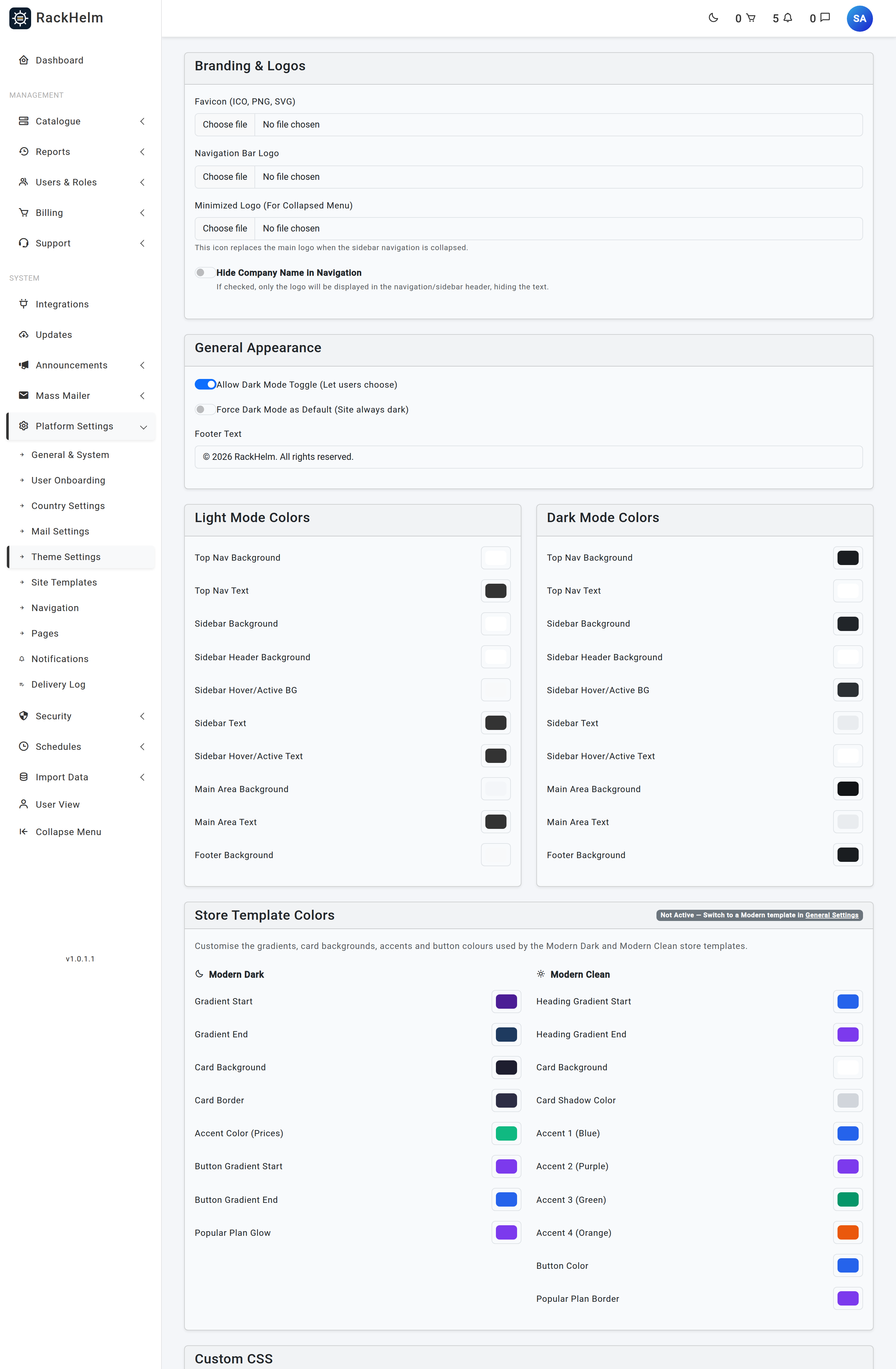
Branding and logos #
| Field | What it does |
|---|---|
| Favicon (ICO, PNG, SVG) | The browser tab icon for both the admin area and the client portal. |
| Navigation Bar Logo | The main logo in the header and sidebar. It is also the logo at the top of every transactional email. |
| Minimized Logo (For Collapsed Menu) | A square mark that replaces the main logo when the sidebar is collapsed. |
| Hide Company Name in Navigation | Shows only the logo in the navigation header, hiding the company name text next to it. |
A preview of the current image is shown above each upload once one is set. Leaving an upload empty keeps the existing file.
General appearance #
| Field | What it does |
|---|---|
| Allow Dark Mode Toggle (Let users choose) | Shows the dark-mode switch so each user can pick their own preference. |
| Force Dark Mode as Default (Site always dark) | Starts everyone in dark mode. |
| Footer Text | The copyright line in the footer, up to 255 characters. Defaults to “© <year> Your Company. All rights reserved.” |
Tip: Save this screen once immediately after installing, even if you change nothing. Both dark-mode switches are stored as explicit values only when the form is submitted; until then they read as off regardless of how the checkbox appears.
Colour palettes #
There are three blocks of colour pickers, thirty-eight in total. Every one is an <input type="color"> and is validated as a six-digit hex value, so you cannot paste an arbitrary string into it.
Light Mode Colors and Dark Mode Colors #
These two blocks share the same ten roles and set the portal chrome. The defaults differ per mode.
| Picker | Light default | Dark default |
|---|---|---|
| Top Nav Background | #ffffff |
#1a1d20 |
| Top Nav Text | #333333 |
#ffffff |
| Sidebar Background | #ffffff |
#212529 |
| Sidebar Header Background | #ffffff |
#2c3034 |
| Sidebar Hover/Active BG | #f8f9fa |
#2c3034 |
| Sidebar Text | #333333 |
#e9ecef |
| Sidebar Hover/Active Text | #333333 |
#ffffff |
| Main Area Background | #f4f6f9 |
#121416 |
| Main Area Text | #333333 |
#e9ecef |
| Footer Background | #f8f9fa |
#1a1d20 |
Store Template Colors #
These only take effect when the matching store template is selected under Platform Settings → General & System → Store Template. The Classic template does not use them.
Modern Dark has eight pickers: Gradient Start (#4c1d95), Gradient End (#1e3a5f), Card Background (#1e1e2f), Card Border (#2d2d44), Accent Color (Prices) (#10b981), Button Gradient Start (#7c3aed), Button Gradient End (#2563eb) and Popular Plan Glow (#7c3aed).
Modern Clean has ten: Heading Gradient Start (#2563eb), Heading Gradient End (#7c3aed), Card Background (#ffffff), Card Shadow Color (#d1d5db), Accent 1 (Blue) (#2563eb), Accent 2 (Purple) (#7c3aed), Accent 3 (Green) (#059669), Accent 4 (Orange) (#ea580c), Button Color (#2563eb) and Popular Plan Border (#7c3aed).
Custom CSS #
The Custom CSS box takes up to 65,535 characters and is appended to the end of the theme stylesheet that both the admin area and the client portal render inline in the page head, so it comes after — and therefore overrides — the colours chosen above.
.navbar-brand img { max-height: 42px; }
.dash-kpi .kpi-val { letter-spacing: -0.02em; }
Warning: HTML tags are stripped from this field before it is saved and again when it is rendered, so it accepts stylesheet rules only — do not try to include a
<style>wrapper or a script. Bad CSS here affects every page including the admin area, so test a change on a page you can still navigate away from.
Troubleshooting #
| Symptom | Cause and fix |
|---|---|
| The screen says it saved but a colour did not change | Confirm you are looking at the right mode — the light and dark palettes are separate — and that the store template you are viewing actually uses that picker. Classic ignores the store colours entirely. |
| Uploaded logo shows as a broken image | The public storage symlink is missing. Recreate it with php artisan storage:link from the application directory. |
| An upload is rejected | The file must be an image and no larger than 2 MB. Very large PNG exports trip this easily; resize before uploading. |
| The dark-mode toggle never appears | Save the theme screen once with Allow Dark Mode Toggle ticked. Until the form has been submitted the setting is not stored and reads as off. |
| Custom CSS is not applied | Check that no tags were included — anything inside angle brackets is removed. Then hard-refresh, since browsers cache aggressively. |
| Emails do not show your logo | The mail layout uses the Navigation Bar Logo specifically, not the favicon or the minimized logo. |


