Announcements are notices shown inside the portal — planned maintenance, a price change, a new product. They can be public or aimed at particular roles, products or product groups, they can be scheduled to appear and disappear on their own, and each one is tracked per customer: whether it was on screen, whether it was opened, whether it was closed. This article is for operators.
The module was rebuilt after 1.0.0.0 and the screens no longer match what that release shipped. The customer-facing side is now a layered deck rather than a run of plain bars: one card on top, the next two peeking out below it, and a pager to flick between them. Announcements gained a style, an icon, a priority and a call-to-action button; there is an archive at /announcements, a header bell that counts unopened announcements, and a dismissal that is remembered per customer instead of being forgotten on the next page load. If you last used this module on 1.0.0.0, read the whole article rather than the parts you remember.
Before you start #
Note: The announcement screens are gated on the
edit_company_settingspermission, which the built-in Administrator role does not hold —RoleSeederwithholds it deliberately. The sidebar entry is gated separately onmanage_settings, which is not aPermissionEnumcase at all, so it is never seeded and cannot be ticked on the Roles screen. In practice only a Super Admin sees the menu and can save an announcement in a default install.
Creating an announcement #
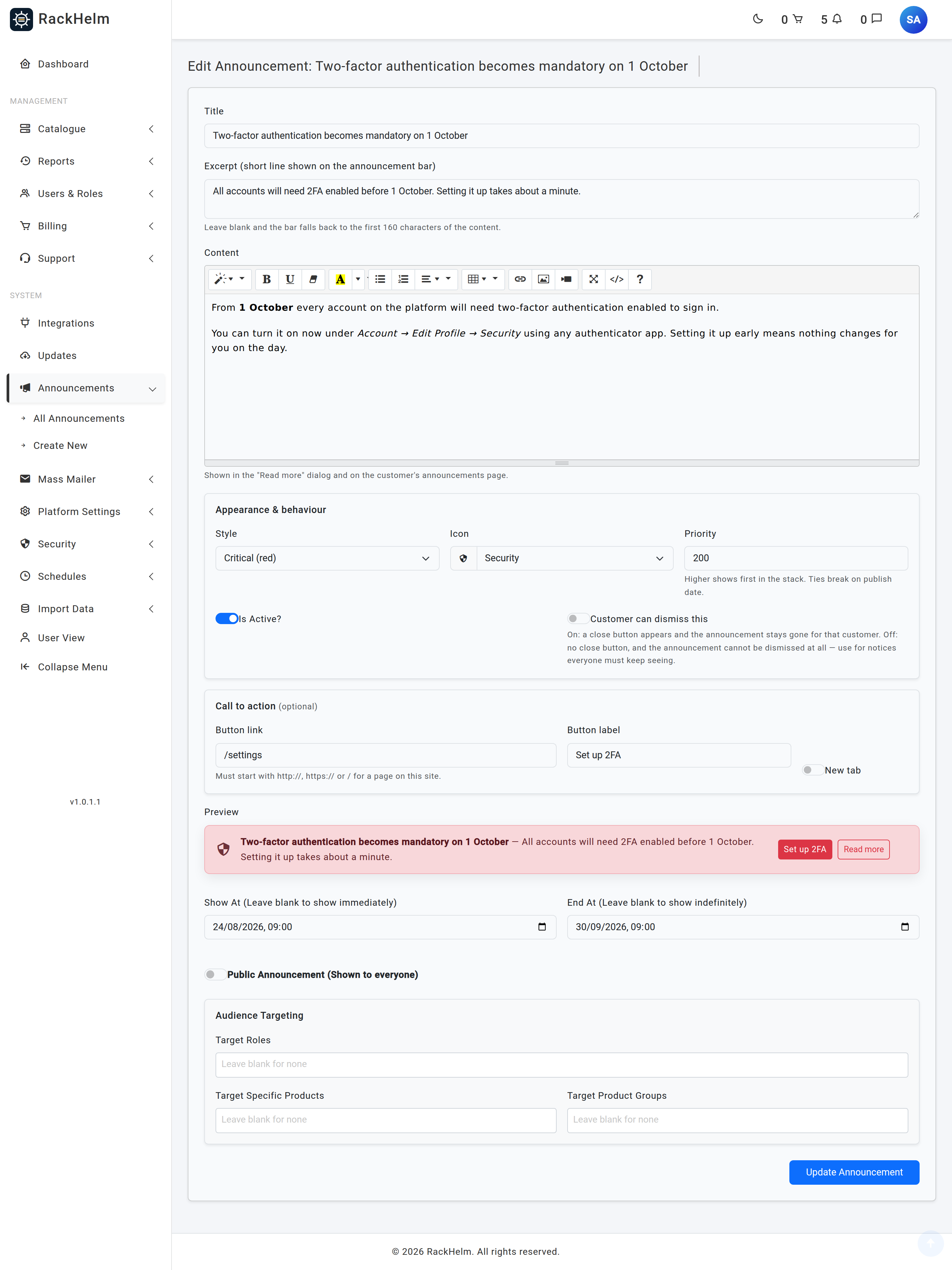
- Open Announcements → Create New, or press Add New Announcement on the list.
- Fill in the Title and the Content — the content editor is a full rich-text editor.
- Optionally write an Excerpt (short line shown on the announcement bar).
- Under Appearance & behaviour, pick a Style and an Icon, set a Priority, and decide whether Customer can dismiss this.
- Optionally add a Call to action: a Button link, a Button label and a New tab switch.
- Check the Preview — it uses the same stylesheet as the real stack, so it is the card itself and not an approximation.
- Set Show At and End At if the notice should appear or expire on a schedule.
- Leave Public Announcement (Shown to everyone) on to show it to everybody, or switch it off to slide the Audience Targeting panel into view.
- Save.
Field reference #
| Field | What it does |
|---|---|
| Title | Required, up to 255 characters. Also the source of the announcement’s URL slug — see the warning under The archive. |
| Excerpt | Optional, up to 1000 characters. This is the line the card shows after the title. Leave it blank and the card falls back to the first 160 characters of the content, tags stripped. |
| Content | Required. Rich text with formatting, lists, tables, links and images. Shown in the Read more dialog and on the announcement’s own page, sanitised on output. |
| Style | Required. One of seven Bootstrap-flavoured looks — see the table below. It sets the card colour, the button colours and the default icon. |
| Icon | Optional. Automatic (matches style) uses the style’s own icon. The list offers Megaphone, Info, Success, Warning, Critical, Maintenance, Server, Cloud, Security, Offer, Pricing, Scheduled, New feature, Downtime, Billing and Notice, plus Custom boxicon class… for anything else. |
| Priority | Integer between -1000 and 1000, default 0. Higher shows first in the deck; ties break on publish date, then on id. |
| Is Active? | The master switch, on by default. Off hides the announcement everywhere regardless of its schedule — including the archive. |
| Customer can dismiss this | On by default. On: a close button appears and the announcement stays gone for that customer. Off: no close button, and the dismiss endpoint refuses the request as well. |
| Button link | Optional. Must start with http://, https:// or /. A link with no label falls back to Learn more; a label with no link is discarded on save. |
| Button label | Optional, up to 60 characters. |
| New tab | Opens the call-to-action link in a new tab, with rel="noopener noreferrer". |
| Show At | Leave blank to show immediately. Before this moment the announcement appears on the admin list only. |
| End At | Leave blank to show indefinitely. Must be the same as or later than Show At. |
| Public Announcement | On shows it to everyone, including logged-out visitors, and clears any targeting on save. Off restricts it to matching signed-in customers. |
| Target Roles | Show only to customers holding one of these roles. |
| Target Specific Products | Show only in relation to these products. |
| Target Product Groups | Show only in relation to these product groups. |
| Product Display Location | Appears once you select products or groups. Show on all pages means anyone who owns a targeted service sees it anywhere in the portal. Show on product pages only means the deck shows it only while the visitor is on that product’s or group’s page. |
Styles and icons #
| Style | Default icon |
|---|---|
| Info (blue) | bx-info-circle |
| Primary (brand) | bxs-megaphone |
| Success (green) | bx-check-circle |
| Warning (amber) | bx-error |
| Critical (red) | bx-error-circle |
| Neutral (grey) | bx-message-dots |
| Dark | bx-message-dots |
Warning: The Boxicons set bundled with RackHelm is a subset. A class that is not in it renders as an invisible blank — no console error, no fallback glyph — so a custom icon can silently leave the card with a gap where the icon should be.
bx-megaphoneis the known example: it does not exist in the bundled set, only the solidbxs-megaphonedoes. The sixteen entries in the Icon drop-down are all verified to exist; if you type your own into Custom boxicon class…, check it renders in the Preview before saving. The validator only checks the character set, with the message “The icon must be a boxicon class name, e.g. bxs-megaphone.” — it cannot tell a missing glyph from a present one.
How targeting is evaluated #
An announcement is only considered at all when it is active and inside its schedule. After that:
- Public announcements are shown to everybody straight away, signed in or not.
- A targeted announcement is never shown to a logged-out visitor.
- If you set only role targets, the customer needs one of those roles.
- If you set only product or group targets, the customer needs to match on products.
- If you set both, the customer must match both — the role test and the product test.
The product test itself depends on Product Display Location. With Show on all pages, the customer qualifies by owning one of the targeted products (or a product in a targeted group) on an order that is active, completed or paid. With Show on product pages only, ownership is not enough for the deck — they must be looking at the targeted product or group page at the time.
Note: That page-context rule applies to the deck only. The archive and the bell relax it back to plain ownership, so a product-page-only announcement still counts towards the bell while the customer is looking at their invoices, and still appears in their archive.
Warning: An announcement with Public Announcement switched off and nothing selected in any of the three targeting boxes matches nobody and is never displayed. It sits on the admin list looking published, with a Targeted badge and a Reach of 0 / 0 / 0.
What the customer sees #
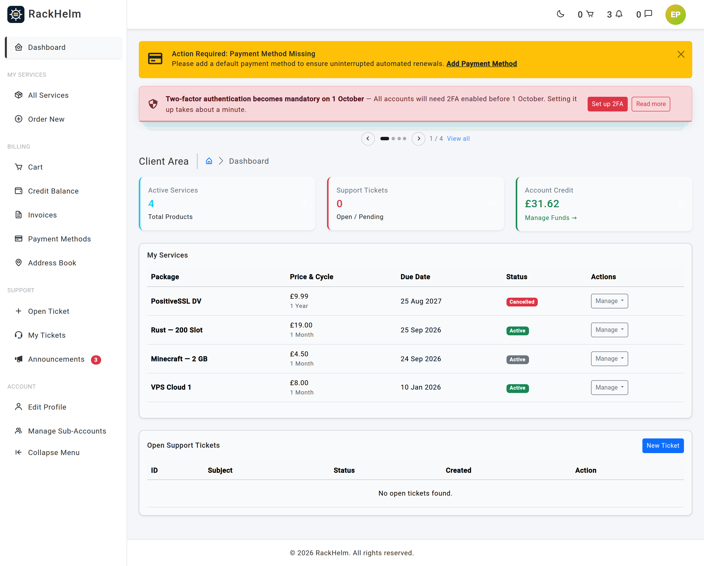
Matching announcements are rendered above the page content on every page that uses the customer layout, which includes the onboarding wizard and the terms re-acceptance screen. The active card shows the icon, the Title, the excerpt line, the call-to-action button if there is one, and a Read more button that opens the full content in a dialog. Up to two more cards peek out below it; the rest are reachable from the pager.
The pager sits under the deck: previous and next arrows, one dot per announcement, an n / total counter, and a View all link to the archive for signed-in customers. Arrow keys work while focus is inside the stack, and only there — a global handler would fight every other arrow-key control on the page.
Auto-rotation #
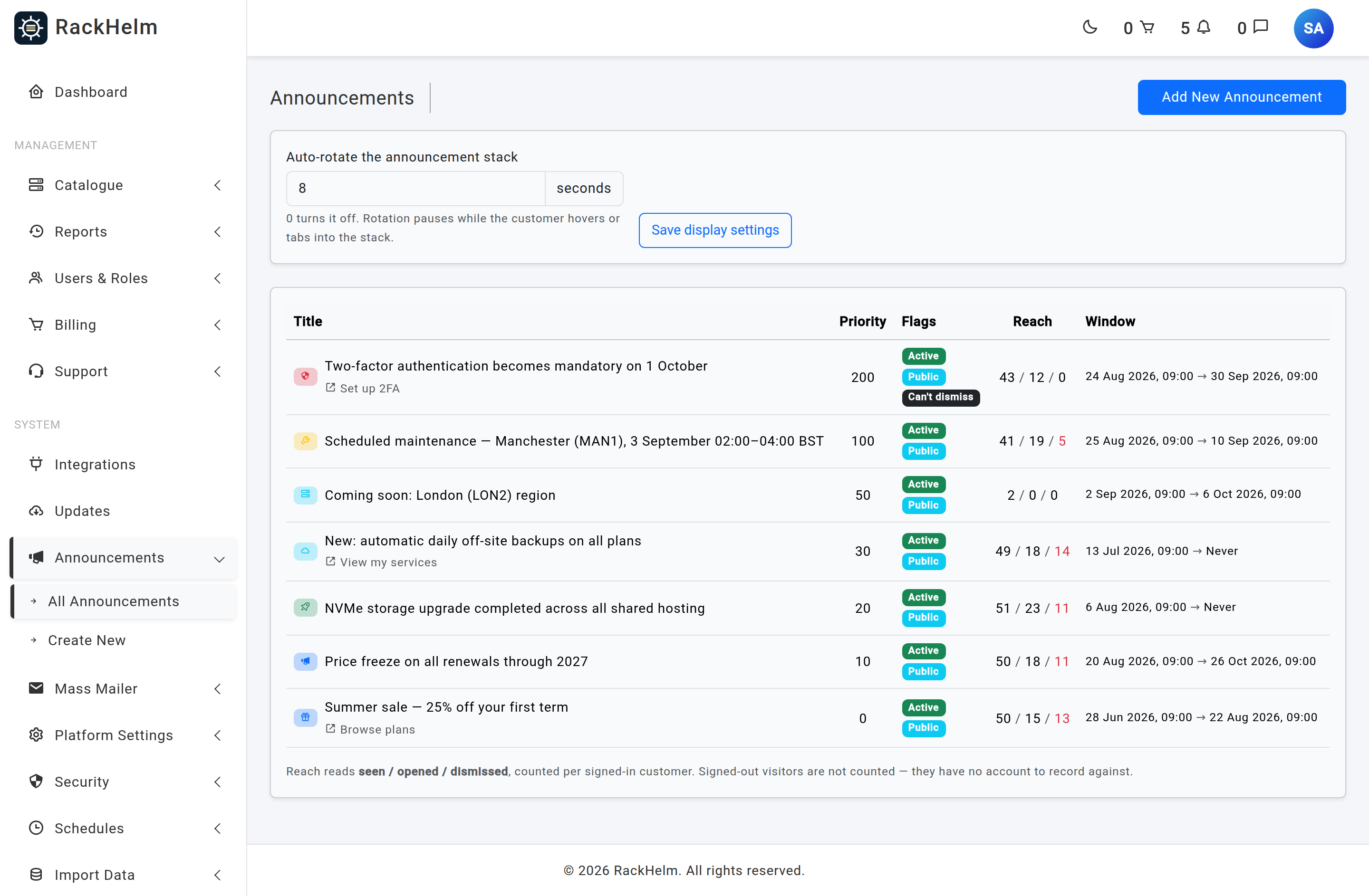
Auto-rotation is configured once for the whole module, on the All Announcements screen: Auto-rotate the announcement stack, in seconds, then Save display settings. It ships switched off, which stores 0 and leaves the deck still until the customer flicks through it. On saving you get either “Announcements will rotate every N seconds.” or “Auto-rotation turned off. Customers flick between announcements manually.”
Note: The field accepts 0 to 120, but any non-zero value below 3 is stored as 3 — while the confirmation message repeats the number you typed. Enter 2 and you will be told “every 2 seconds” and get 3. Rotation also does nothing at all when there is only one card, when the browser tab is in the background, while the pointer or keyboard focus is inside the stack, or for a visitor whose system is set to reduce motion.
Dismissal, and putting an announcement back #
For a signed-in customer the close (×) writes a row and the announcement stays gone — on every device, not just that browser. Signed-out visitors have no account to record against, so theirs is remembered in the browser’s local storage instead and is lost when that storage is cleared.
Warning: A dismissal survives an edit. This is deliberate — fixing a typo must not re-nag everyone who has already read the notice — but it means correcting an announcement does not bring it back for anyone who closed it. Use the Re-show to everyone who dismissed it action (the circular-arrow button in the Actions column, which only appears once someone has dismissed it). It answers either “Announcement restored for N customers.” or “Nobody had dismissed that announcement, so there was nothing to restore.”
Switching Customer can dismiss this off removes the close button and is enforced on the server as well: a hand-rolled request to the dismiss endpoint is refused with “This announcement cannot be dismissed.” Use it for notices everyone must keep seeing, and expect the top card of the deck to have no × while it is live.
Reach #
The Reach column on the admin list reads seen / opened / dismissed, counted per signed-in customer:
- seen — the card was actually rendered on screen for that customer. It is recorded at most once per customer per announcement, not on every page view.
- opened — they opened the Read more dialog or the announcement’s own page.
- dismissed — they closed it. A non-zero figure here is shown in red and unlocks the re-show action.
Signed-out visitors are never counted, because there is no account to record against. A public announcement on a busy storefront can therefore have far more real views than its seen figure.
The archive and the bell #
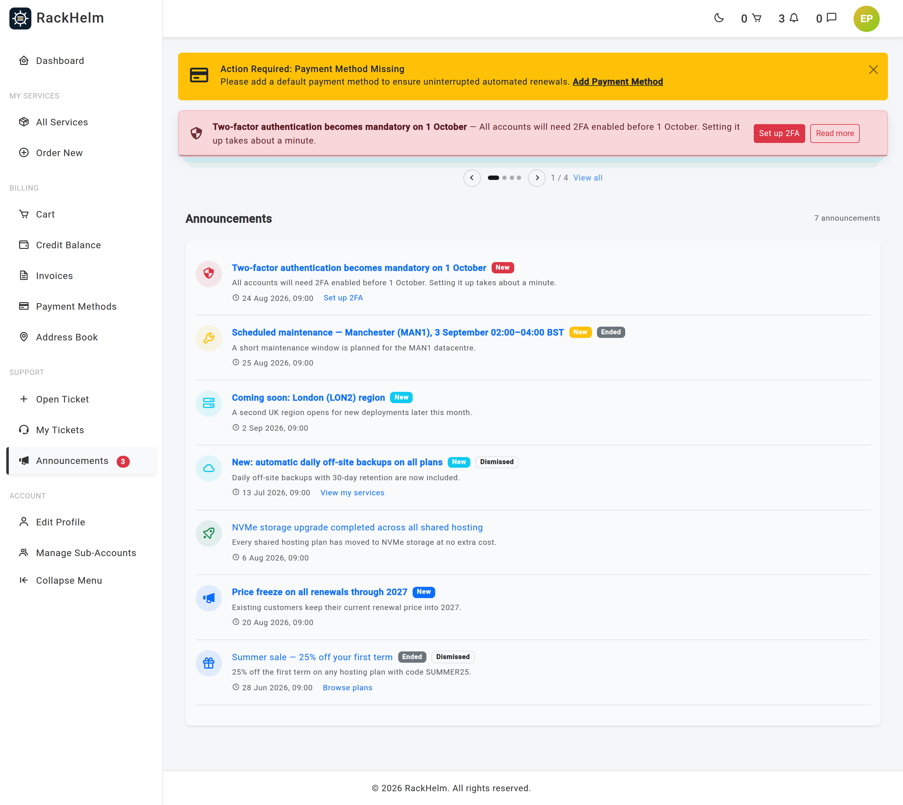
Signed-in customers get an archive at /announcements, ten to a page, reachable from View all on the deck, from the header bell, and from the Announcements entry in the client menu. It lists everything they are entitled to read — live or finished, dismissed or not — with a New badge on anything they have not opened, an Ended badge once End At has passed, and a Dismissed badge on anything they closed. Each row links to the announcement’s own page. An empty archive reads “Nothing to catch up on”.
The header bell counts announcements the customer has never opened and lists the five most recent in its drop-down; the badge is kept in sync as they read or dismiss cards without reloading the page. The bell ignores page context, so a product-page-only announcement still counts. The same count can be shown against the client menu entry through the announcements_unread badge in the navigation editor.
Warning: Is Active? and End At are not interchangeable. Letting End At pass takes the announcement off the deck but leaves it in the archive, marked Ended. Switching Is Active? off treats it as retracted: it disappears from the archive and the bell too, and its own page answers 404 — so a link you have already emailed to customers stops working. The 404 is deliberate; slugs are derived from titles and so are guessable, and a 403 would confirm that a private announcement with that slug exists.
Note: The slug is generated from the title the first time the announcement is saved and is never regenerated afterwards, so renaming an announcement does not break a link you have already sent. Admin URLs are unaffected: they address announcements by id.
Tip: An announcement reaches people who are already in the portal. To reach customers by email, use the mass mailer instead — see The Mass Mailer.
Troubleshooting #
| Symptom | Cause and fix |
|---|---|
| Nobody can see a new announcement | Check Is Active?, then the schedule: a Show At in the future or an End At in the past both hide it. The Window column shows both, as Immediate and Never when they are blank. |
| A targeted announcement never appears | Targeting is set but every box is empty, or the customer matches only one of the role and product tests when both are set. |
| Customers who own the product do not see it on the deck | Product Display Location is Show on product pages only, so the deck shows it on that product’s page rather than everywhere. It is still in their archive and still counts on the bell. |
| The icon is missing — the card shows a blank space | A custom boxicon class that is not in the bundled subset. Switch the Icon field back to Automatic (matches style) or pick one from the list. |
| “The ends at field must be a date after or equal to show at” | The end date precedes the start date. Correct one of them. |
| “The link must start with http://, https:// or / (a path on this site).” | The Button link is a bare domain or a scheme the portal will not render. Write it in full, or as a path beginning with /. |
| An edited announcement did not come back for customers who had closed it | Dismissals survive edits by design. Use Re-show to everyone who dismissed it. |
| The deck never rotates | Auto-rotation is 0 (the default), there is only one announcement, the tab is in the background, the customer’s pointer or focus is in the stack, or their system is set to reduce motion. |
| A link to an announcement now returns 404 | It was switched off with Is Active?, or the recipient is not in its audience. Deactivating retracts it everywhere; to retire one but keep it readable, set an End At in the past instead. |
| Reach is 0 / 0 / 0 on a public announcement that is clearly being read | Only signed-in customers are counted. |
| Guests do not see it | Only public announcements reach logged-out visitors. |
| The Announcements menu is missing | You are not signed in as a Super Admin. See the permission note at the top of this article. |


